CSS Gaussian blur behind a translucent box
I normally write about Ruby or occasionally JavaScript. But recently I had an interesting experience in CSS land applying a (responsive) Gaussian blur over part of an image.
A snazzy effect, and it might be obvious to bearded CSS gurus. I, however, had to think on it quite a bit. Here’s what I came up with. Criticisms welcomed.
Get something working
Let’s get something easy, yet decent-looking, working. I find instant gratification in this context to be very motivating. Or I’m lazy.
<style type="text/css">
#bg {
  background-image: url('freelancer-desk.jpg');
  background-position: center top;
  background-size: 1080px auto;
  padding: 70px 90px 120px 90px;
}

#search {
  padding: 20px;
  background: rgb(34,34,34); /* for IE */
  background: rgba(34,34,34,0.75);
}

#search h2, #search h5, #search h5 a {
  text-align: center;
  color: #fefefe;
  font-weight: normal;
}
#search h2 { margin-bottom: 50px }
#search h5 { margin-top: 70px }
</style>

<div id="bg">
  <div id="search">
    <h2>Awesome freelancers at the right price</h2>
    <h5><a href="#">How it works »</a></h5>
  </div>
</div>
Easy stuff. We’re just adding a partially transparent background to a box with CSS. (Hey this is a browser so the “screenshots” below are real html…)
Awesome freelancers at the right price
How it works »
Fail
Not bad, but a little blurring would really class it up. Let’s just see what adding a blur does. Webkit/Blink/Chrome has the CSS blur filter while Firefox uses SVG.
#search {
  -webkit-filter: blur(10px); /* Chrome, Opera, etc. */
  filter: url('blur.svg#blur'); /* Older FF and others - http://jordanhollinger.com/media/blur.svg */
  filter: blur(10px); /* Firefox 35+, eventually all */
}
Awesome freelancers at the right price
How it works »
Suck. #search and everything in it is blurred, but the background isn’t. This is where I got stuck for awhile. I knew that I had to blur the background image itself - not what was on top if it. But I only wanted to blur a selected area of it, while still allowing it to dynamically resize. This triggered a memory of layer masks from my Photoshop days. Thinking in those terms, I would have duplicated the background layer, blurred it, then added a layer mask the shape of the rectangle.
Win!
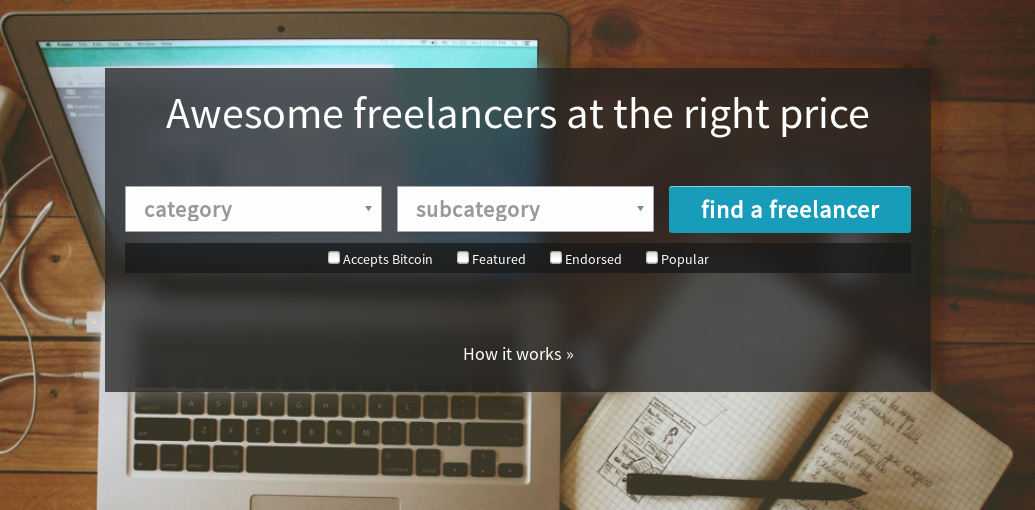
Turns out that something very similar can be done in CSS. In addition to the original background layer, we can apply the background image to #search, but force the background width and vertical position to be the same as the original’s. They’ll line up, but only the area in the #search box will be visible. We blur that layer, then place the black translucent box and it’s contents on top.
Awesome freelancers at the right price
How it works »
Go ahead - resize your window. Cool, no? Perhaps there’s a more straightforward solution that I missed, but I actually don’t think this is too bad. It only works over images though, not text. (I wonder if something similar could be done with text using “overflow: hidden”…) Here’s the final CSS and markup with some @media query goodness thrown in:
<style type="text/css">
#bg, #search-bg {
  background-image: url('freelancer-desk.jpg');
  background-repeat: no-repeat;
  background-size: 1080px auto;
}

#bg {
  background-position: center top;
  padding: 70px 90px 120px 90px;
}

#search-container {
  position: relative;
}

#search-bg {
  /* Absolutely position it, but stretch it to all four corners, then put it just behind #search's z-index */
  position: absolute;
  top: 0px;
  right: 0px;
  bottom: 0px;
  left: 0px;
  z-index: 99;

  /* Pull the background 70px higher to the same place as #bg's */
  background-position: center -70px;

  -webkit-filter: blur(10px);
  filter: url('/media/blur.svg#blur');
  filter: blur(10px);
}

#search {
  /* Put this on top of the blurred layer */
  position: relative;
  z-index: 100;
  padding: 20px;
  background: rgb(34,34,34); /* for IE */
  background: rgba(34,34,34,0.75);
}

@media (max-width: 600px ) {
  #bg { padding: 10px; }
  #search-bg { background-position: center -10px; }
}

#search h2, #search h5, #search h5 a { text-align: center; color: #fefefe; font-weight: normal; }
#search h2 { margin-bottom: 50px }
#search h5 { margin-top: 70px }
</style>

<div id="bg">
  <div id="search-container">
    <div id="search-bg"></div>
    <div id="search">
      <h2>Awesome freelancers at the right price</h2>
      <h5><a href="#">How it works »</a></h5>
    </div>
  </div>
</div>